Brand guide · Internal reference
Everything here is the working system, not a mock-up of one — the colour values are read off the live stylesheet, so this page and the site can never disagree. Use it when making anything else: another page, a blog post, a flyer, a social graphic.
01
Wordmark
Set in Fraunces 600 with the display tracking. It is type, not a logo file — so it stays sharp at any size and can be set fresh in any tool that has the font.
Rules
- Clear space on all sides is at least the cap-height of the M.
- Minimum size is 90px wide on screen, 25mm in print.
- Ink on light grounds; Shell on Forest. Never on Pistachio at small sizes.
- The script line sits under the wordmark, never beside it.
Never
- Don’t set it in another face, or in Fraunces italic.
- Don’t stretch, outline, or add a shadow.
- Don’t set it all-caps or all-lowercase — it’s MiMi Crack.
- Don’t place it over a busy area of a photograph.
02
Colour
Warm cream, espresso ink, and one green taken from the grease itself. Click any value to copy it — hex for the web, RGB for design and print tools.
Grounds
Backgrounds. The page is warm off-white by default; the other two mark a change of section, never a change of importance.
Shell
--color-shell
The page. Default background everywhere.
Shell Warm
--color-shell-warm
Alternating sections and cards, to break a long page.
Paper
--color-paper
Input fields and raised surfaces. Use sparingly — it reads colder than the shell.
Ink
Text. Three weights of emphasis and nothing else — if something needs more attention, make it larger, don't make it blacker.
Ink
--color-ink
Headlines, solid buttons, anything primary.
Ink Soft
--color-ink-soft
Body copy. The default for paragraphs.
Ink Mute
--color-ink-mute
Eyebrows, captions, meta, placeholders.
Hairline
--color-hairline
Dividers and borders. Ink at 8% — never a solid rule.
Green
Taken from the grease itself, not chosen from a palette. It is the only accent — resist adding a second.
Pistachio
--color-pistachio
Accent blocks and highlights.
Pistachio Soft
--color-pistachio-soft
Tint panels, selected states, photography slots.
Pistachio Deep
--color-pistachio-deep
Accent text, numerals, the script line.
Forest
--color-forest
Footer, dark blocks, focus rings.
Clay
Warmth without introducing another colour. Use where green would feel clinical.
Clay
--color-clay
Warm tint, error and notice panels.
Clay Soft
--color-clay-soft
Quiet tint panels and photography slots.
03
Typography
Three faces, all free from Google Fonts, so anyone making a flyer or a post can install them in a minute.
Display
Fraunces
Feed the soil.
Weight 600. Tracking −0.028em, leading 0.98. Everything from the wordmark down to sub-headings.
Google Fonts — free, open licence
Body & UI
Inter
A scalp-first conditioning grease, made in small batches.
Regular. Line height 1.65–1.72. Every paragraph, label, form field and button.
Google Fonts — free, open licence
Script accent
Parisienne
Stimulates Scalp
Reserved for the line from the jar. Two or three uses per page, never for anything you expect to be read quickly.
Google Fonts — free, open licence
The scale
Fluid — sizes shown are what they compute to at your current window width. Resize and they update.
Hero
.display.display-hero
Feed the soil.
Fitted to the container width by <FitText>, not this class alone.
Section
.display.display-xl
Seventeen oils and two butters.
Section openers.
Sub-section
.display.display-lg
Where it's going
Sub-heads and card titles.
Card title
.display.display-md
Feeds the scalp
Small headings inside cards and lists.
Body
.prose-airy
Grease your parts, seal your ends, and let the scalp do what it already knows how to do.
Default paragraph. Never set body copy in the display face.
Eyebrow
.eyebrow
Why it works
Section labels. Uppercase, 0.22em tracking.
04
Layout
Space does the work that borders and boxes would otherwise do. When something needs separating, add room before you add a line.
- Page gutter
clamp(1.25rem, 5vw, 5rem)- `.shell-x`. Every full-width section uses it.
- Section rhythm
clamp(5rem, 13vh, 10.5rem)- `.section-y`. Vertical breathing room between sections.
- Card radius
1.5rem- Bento cells, panels, tint blocks.
- Large radius
1.75rem- Photography, feature panels.
- Buttons
Full round- Pills only. No square buttons anywhere.
05
Components
Buttons
Pills only. One solid button per view — if two things look equally primary, neither is.
Links
An underline that draws itself
Inline links underline on hover over 460ms. Never blue, never underlined at rest.
Tint panel
Pistachio Soft
For quiet emphasis inside a section.
Statistic
9.5 oz
269g net
06
Motion
One easing curve, used for everything. Movement is slow and settles — nothing snaps, nothing bounces. All of it is disabled under prefers-reduced-motion.
- Soft easing
cubic-bezier(0.16, 1, 0.3, 1)- The only easing curve. Fast out, long settle.
- Reveal
900ms- Scroll-triggered rise. Stagger siblings by 70–140ms.
- Line wipe
1100ms- Masked headline reveal.
- Hover
420–500ms- Buttons, links, cards. Slow enough to feel considered.
07
Photography
Soft daylight, warm surfaces, generous empty space around the jar. Hard flash, cold light and busy backgrounds are all off-brand — the product is pale green and gets lost against clutter.
Packshot — jar upright
Texture — macro, raking light
In use — fingertip in the part
Portrait — Carmel, natural light
Until real photography exists these slots ship as-is — captioned with the shot that belongs there rather than filled with something approximate.
08
Voice
Walking the journey of commitment together. Warm and direct — a person who knows hair, not a brand doing a voice.
Plain and specific. "9.5 oz" beats "generously sized".
Never oversell. It is a cosmetic grease, not a treatment — no growth or medical claims, ever.
Warm, not cute. Talk like a person who knows hair, not a brand doing a voice.
Short sentences carry the weight. Let the space do the rest.
Not this, this
Not this
Revolutionary breakthrough formula!
This
Seventeen oils and two butters.
Not this
Guaranteed to regrow your edges
This
Feeds the scalp so ends stay conditioned.
Not this
Luxurious self-care experience
This
Four steps, every day.
A legal note that is not optional: MiMi Crack is a cosmetic product. Nothing written for it — on the site, on a flyer, in a caption — may claim it grows hair, treats hair loss, or does anything medical. “Hair Fertilizer” is the name and the metaphor; it is not a claim.
09
Icons & share cards
The icon is the wordmark reduced to one letter — its uppercase M, not a separate logo. The share card is what a link looks like in a text message, which before launch is most of where the brand appears at all.




Where they live
src/app/favicon.ico— 16, 32 and 48, for browser tabs.src/app/icon.png— 512, for high-DPI and install prompts.src/app/apple-icon.png— 180, the iOS home screen.public/og/— the 1200 × 630 share cards.
Every icon size is drawn at its own size rather than shrunk from one large one, so Fraunces’ optical-size axis thickens the small ones instead of leaving hairlines that vanish in a tab. Above the tab, the M is never used alone — the full wordmark is.
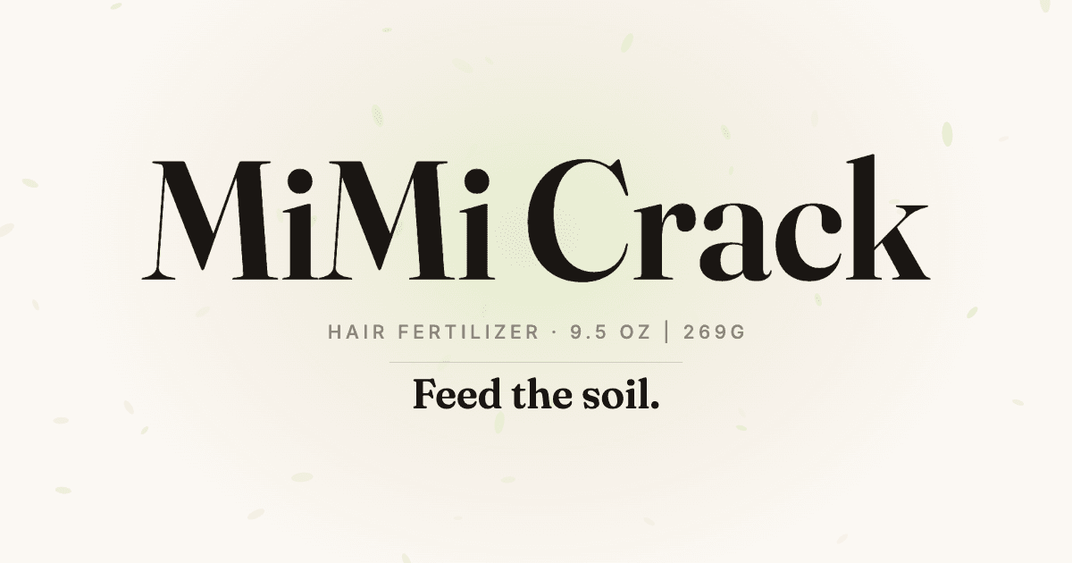
The site, the home page, and anything without its own
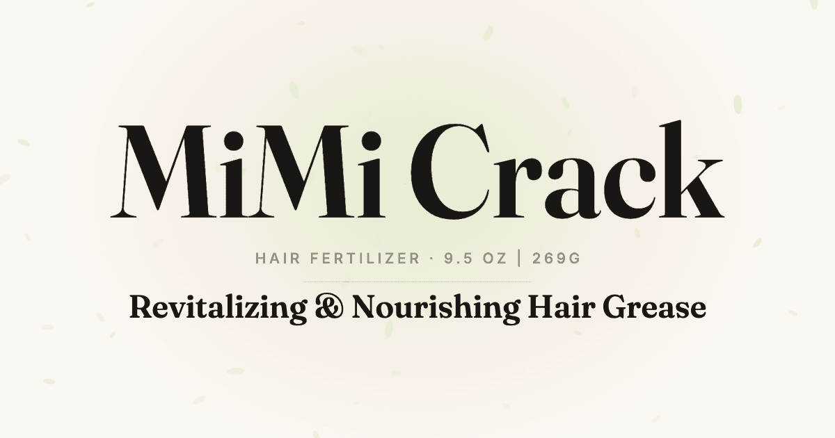
Product
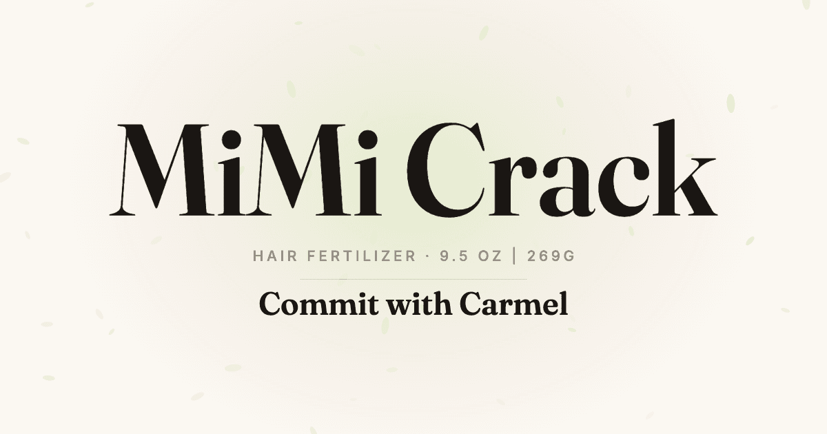
About
The teaser — redrawn for every day of the countdown
All of it is drawn by node scripts/brand-assets.mjs — run it, open the page it prints, press Generate. Before launch it also draws one card per remaining day, so a link shared today says how many days are left rather than repeating the date. The catch is that messaging apps cache link previews: the count is only as fresh as the last time the app fetched the page. After Tuesday, September 22 at 5:00 PM PDT the countdown cards go unused and the default one takes over.